Chat
The React chat components in @datalayer/agent-runtimes — the conversation,
the composer, and everything around them. The Loop Web workspace
assembles these into a full workspace; this page is the components
themselves, for a host embedding a chat of its own.
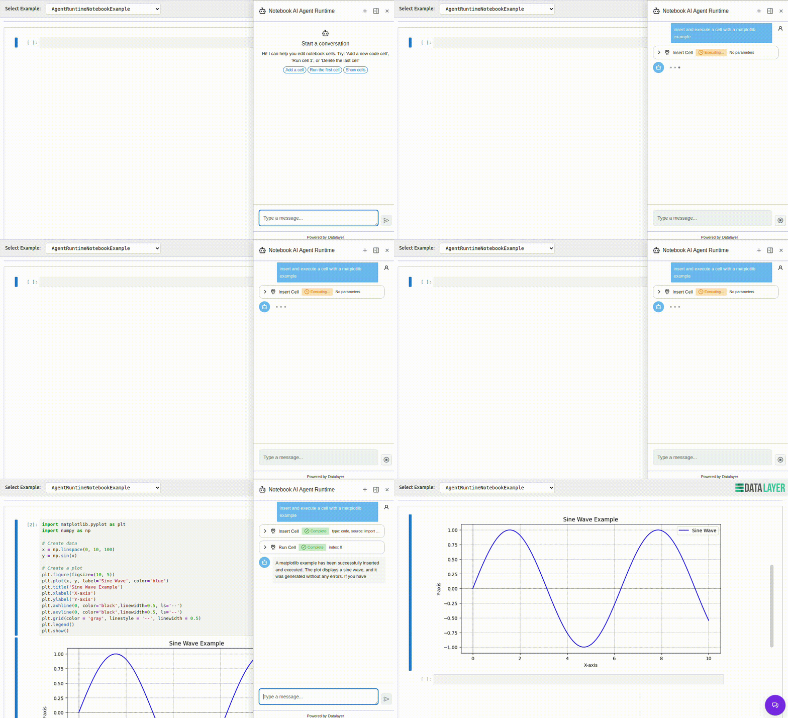
ChatBase
The transcript-and-composer core. It owns the conversation: streaming responses, tool-call rows with approval flows, the message list as a centred reading column, and the empty state that introduces the agent with its spec's own suggestions. Around it:
ChatSidebarandChatFloatingwrap the same core for a side panel or a floating window.notebookToolSurfacesId— name a notebook document and notebook tool results render inline in the transcript: a cell that was inserted, updated or run appears under its tool row as a captioned surface — the change first (the cell source, read-only), then its outputs bound to the live model's output area, so a run that prints as it goes streams into the transcript.executeCodeshows only its outputs. A host passing its ownrenderToolResultoverrides this outright.onSendReadyhands the host imperative controls —send,stop,newChat— for a page whose input lives outside the component (the Loop workspace's prompt does).
InputPrompt
The composer, one component in every placement. It wraps the editor and adds the rows around it:
- The editor (
InputPromptBase): a plain textarea variant, or the lexical variant where/opens the command menu and@mentions agents, with typing suggestions cycling in the placeholder. - The session-controls footer: the agents, tools, skills and model
menus — each drawn when asked for, opening onto an honest count of zero
rather than disappearing when empty — plus
footerExtras, a trailing-edge opening for the host's own controls (the Loop's + — start the conversation over — arrives that way). - The context band:
ContextPieand the token counts, shown as soon as the agent accounts for itself. draggablewraps the whole prompt inFloatingCard: an absolutely positioned, draggable card — the same composer, floating over a canvas instead of docked under it.
Prompt regions
Four regions surround the input, each a list of bands rather than a single
slot — see chat/prompt/stack:
| above the input | below the input | |
|---|---|---|
| inside the box | InPromptHeader | InPromptFooter |
| under the box | BelowPromptHeader | BelowPromptFooter |
A band can reserve height for late-arriving content, draw as a flex row of controls or as a self-painting block, and disappear entirely when empty.
The empty state
ChatEmptyState introduces the agent — icon, name, description, and its
spec's suggestions as clickable chips — centred at the top of the canvas,
where the first message will appear beneath it.
Where the pieces meet Loop
In the Loop workspace, all of this is assembled by the chat plugin: the
composer's placement (bottom, bottom-chat, floating) is plugin
configuration, the agent's tools arrive through the LoopFrontendTool
extension point, and the editors beside the conversation are contributions
the shell hosts. See Loop Web.